
Brand Guidelines
The Imprint visual identity
The Brand Guidelines bring together the core elements of the Imprint visual identity to help partners, exhibitors and collaborators represent the Fair consistently across their own communications.
Whether you're creating a website feature, designing a newsletter, preparing printed material or promoting your participation on social media, these resources provide everything needed to maintain a clear and recognisable Imprint identity. The toolkit includes official logos, colour specifications, typography guidance and recommendations for applying the brand across both digital and printed formats.
Please use the supplied artwork and assets wherever possible rather than recreating or modifying elements of the identity. Consistent use of the Imprint brand helps strengthen recognition of the Fair while ensuring all communications feel connected as part of a single campaign.
Logo
The Imprint logo is the primary identifier for the Fair and should always be used in its original form.
The logo should always remain clearly visible, with adequate clear space surrounding it, and should never be stretched, distorted, rotated or recreated.

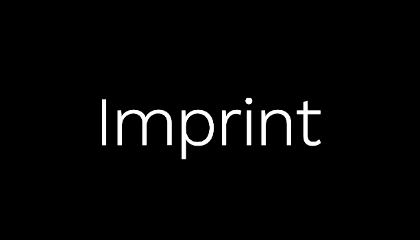
Reversed Logo (White)
Recommended for use on dark backgrounds across newsletters, websites, social media and printed materials.
Colour Palette
The Imprint palette combines a restrained neutral base with a distinctive accent colour.

Typography
Typography plays an important role in the Imprint identity, balancing clarity with a refined editorial character. This section outlines the recommended typefaces, hierarchy and suggested alternatives where the primary fonts are unavailable.
Primary Accent
HEX: #024B49
RGB: 2 / 75 / 73
Primary Logo (Black)
Recommended for use on light backgrounds across newsletters, websites, social media and printed materials.
Primary Accent
HEX: #024B49
RGB: 2 / 75 / 73
Logo Usage
Please:
✓ Use supplied artwork wherever possible
✓ Maintain clear space around the logo
✓ Use the reversed logo on dark backgrounds
Please avoid:
✕ Stretching or distorting the logo
✕ Altering colours or typography
✕ Placing logos on visually busy backgrounds
Primary Accent
HEX: #024B49
RGB: 2 / 75 / 73
Co-branding
Where Imprint appears alongside another organisation, both identities should be given equal prominence unless otherwise agreed. Maintain generous spacing between logos and avoid altering proportions or colours to achieve alignment.
If you require a bespoke lock-up or co-branded graphic, please contact the Imprint team before creating artwork.